Hot Line In a Box

As part of a four week engagement, the team was tasked with creating an identity that emphasized Hotline in a Box's multidimensional approach of setting up a crisis hotline. A secondary goal was to build a universal and easy-to-use visual language that could be expanded by their internal team. Hotline in a Box aims to provide a global set of tools to support the assessment, set up, and management of humanitarian crisis hotlines. Crisis management is messy and stressful, and crisis hotlines in particular lack professional standards and are challenged by the changing nature of the technology landscape. The Hotline in a Box toolkit, because it will be publicly available (for free) to a global audience, and is backed by the world's most respected humanitarian actors, has the potential to be The global benchmark for communicating with crisis-affected people which, quite literally, saves lives.

For a brand that changes in every crisis we wanted to create an identity that can be universal.
We came up with two concepts: 1.Sunrise and 2.Dials
Identity: 1. Sunrise

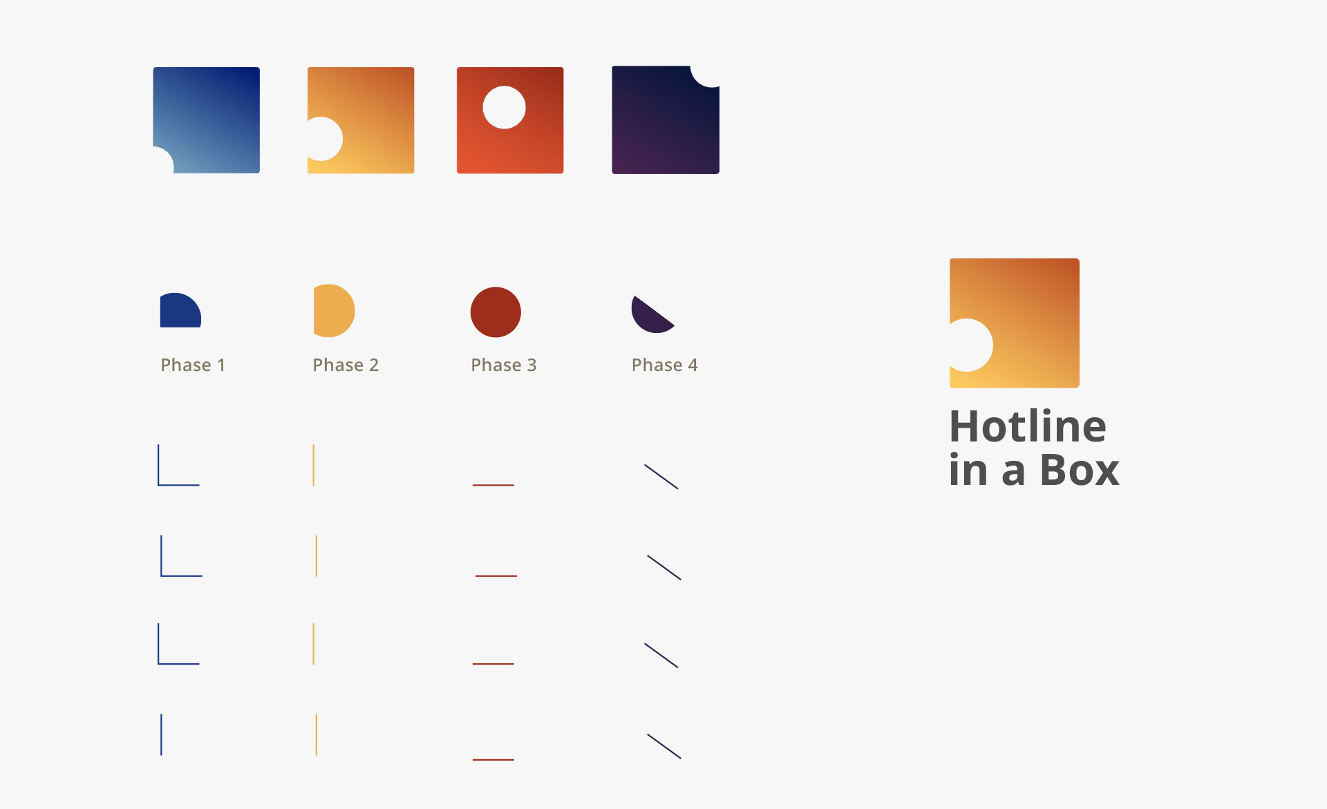
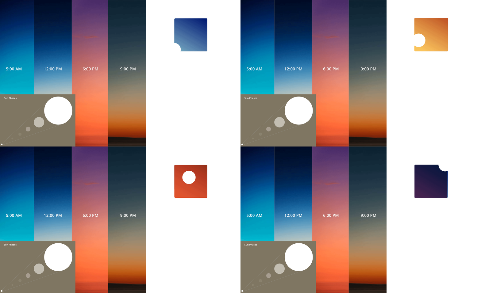
This concept represents Hotline in a Box as a day-or-night, rain-or-shine organization. Day part gradients were a huge influence in our explorations as we want to communicate HIAB as a set of tools ready to solve any crisis at a global scale. The gradients and the white sun express progression and healing over time, which brings a comforting tone to the brand.

Colors & Patterns: Expressing the Brand

This logo represents different crises in multiple timezones. The colors where heavily inspired by the sunrise and sunset. The iconography for the all stages and phases come from different sun positions. The interaction patterns could be infinite based on the motion of the sun.

Iconography: Phases

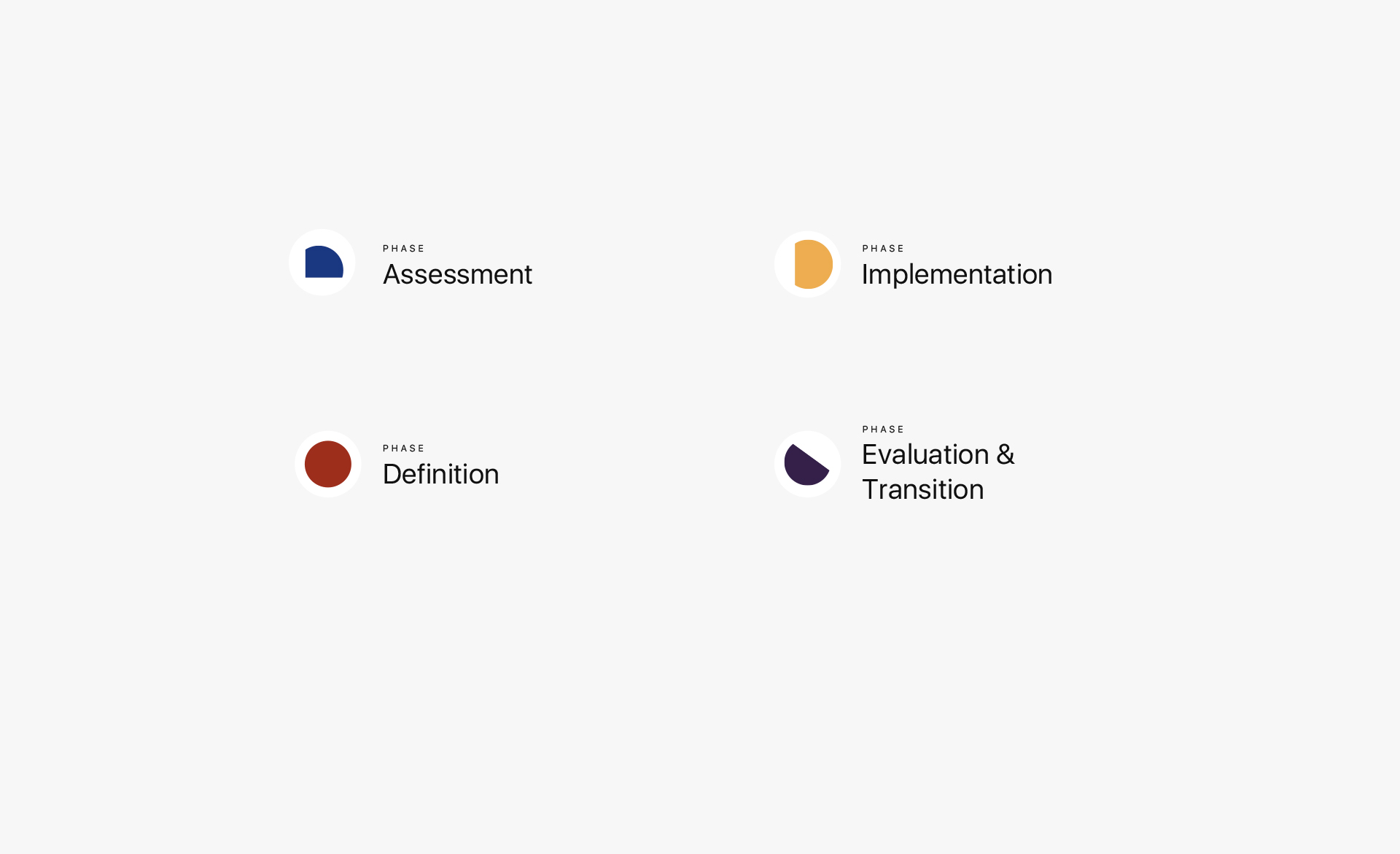
Every crisis is unique, developing in different ways and at varying speeds. This toolkit provides four phases to help give multiple solutions to communities, depending on which one fits best. I took the various sun shapes from the logo itself to give a simple and fresh look to each phase.

Hotline in a Box and Partners

2. Dials

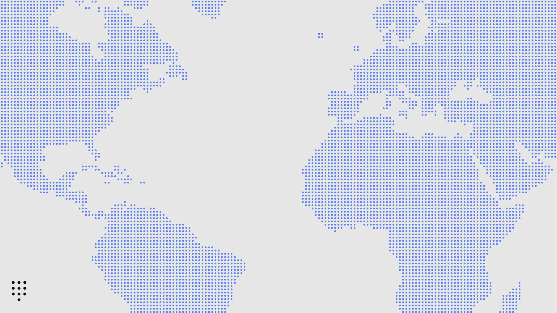
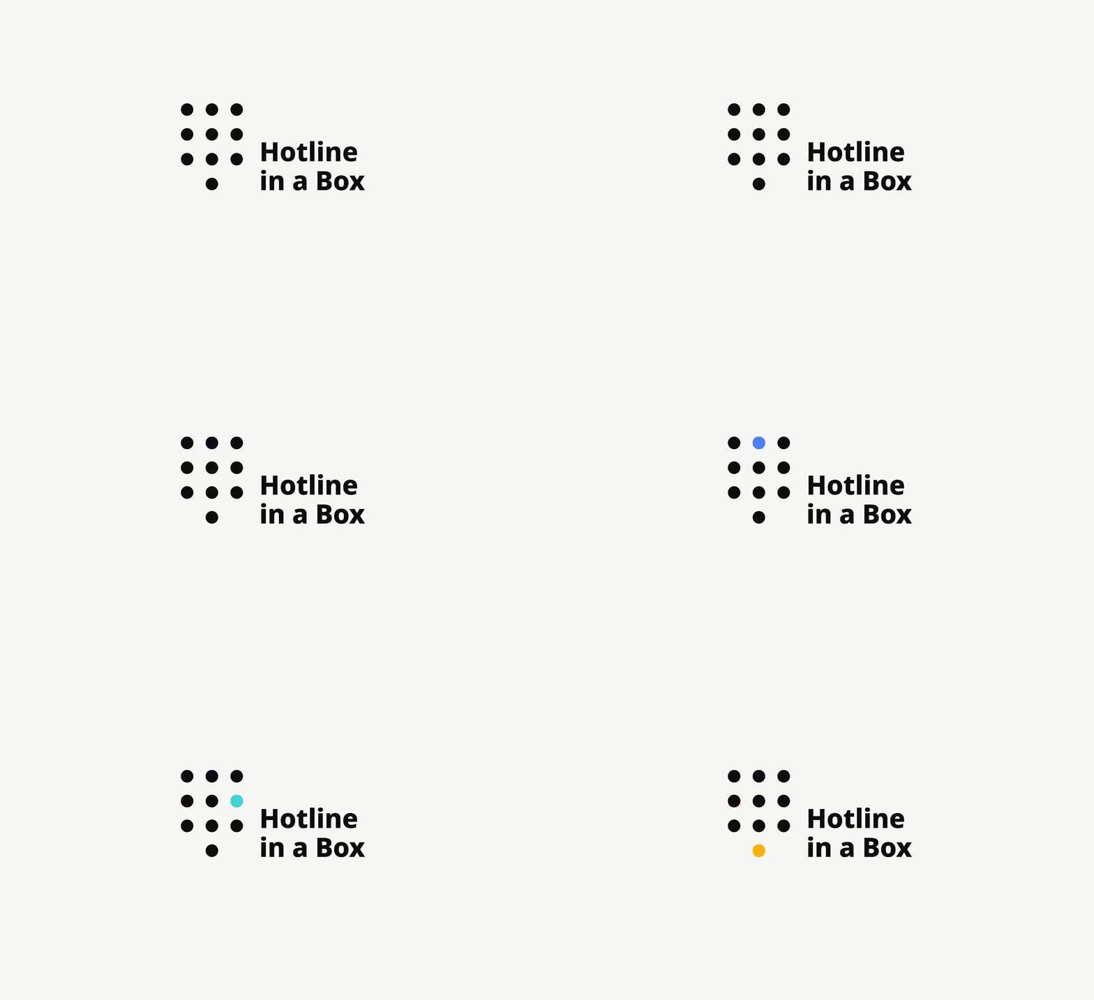
This route brings focus to the universal pictogram of a phone's dial pad. In its simplest form, a dial pad is reduced to an abstract grid of dots.The simplicity of a phone’s dial pictogram helped us quickly build a visual language that spans patterns, iconography, and infographics

Design System

We made the dotted logo patterns an extention of the brand.

Iconography

We wanted to keep the Iconography simple but at the sametime not too abstract. We gave it a humanistic and positive look without making it too cutsy. Same principle goes for color selection.

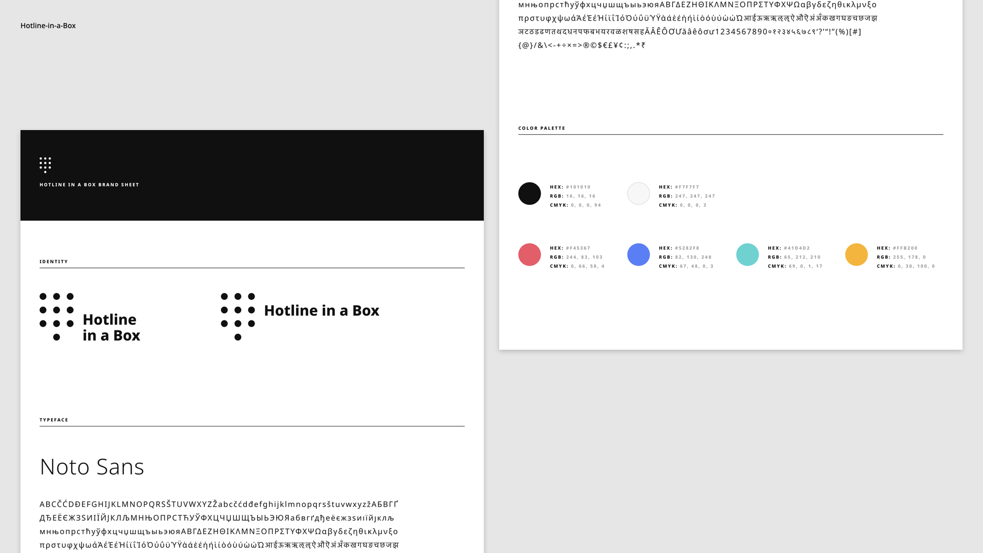
Typeface - Noto

The biggest limitation in creating the brand expression was accessibility. We wanted to pick a typeface that could be legible in as many languages as possible. We chose Noto as it helps to make web and print materials legible across platforms for many languages. Currently, Noto covers over 30 scripts and it's free through Google Fonts.

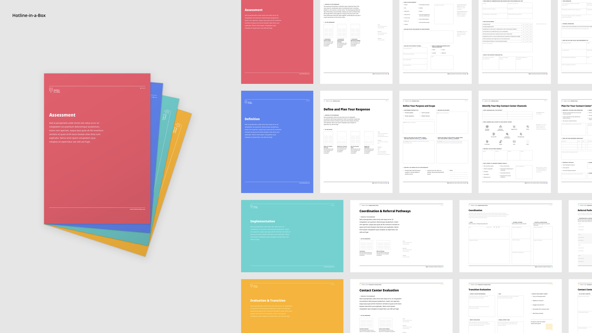
Worksheets

Worksheets were a fundamental part of the process. We had complex information that had to be simplified and easy to use in a crisis. It had to be understandable globally and have universal measurments. As an example, all the designs were applied to A4 pages. The information architecture of it was another key part of this process.

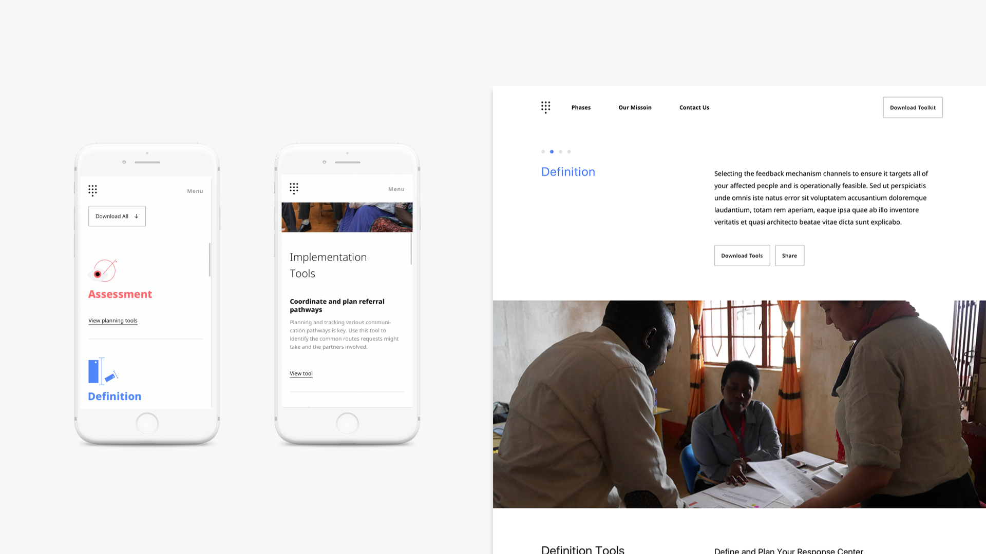
Mobile and desktop